

Websites and pages that perform poorly against Google Core Web Vital performance metrics are set to see their search engine ranking performance decline after May 2021. Understand what the Google Core Web Vital metrics are, how they apply to your website and how you can check your website’s performance and ensure continued search engine ranking.
Background
Google Core Web Vitals are a set of metrics that Google will start to use as of May 2021 as part of its Search Ranking algorithm, i.e. how Google decides where to place your website pages in search results.
Most people still find the stuff they’re looking for on the web by some kind of Google based search. Google wants to keep it this way and is constantly trying to improve the quality of the search results it displays to users. Until recently, Google’s quality measurements have focussed on the structure of a website and web page, the content of a particular website page and the perceived authority of that website domain across the wider web.
Anyone trying to achieve organic search result placements for their website and web pages will be familiar with the three main tenets of Search Engine Optimisation, namely technical SEO – ensuring there are no technical errors on your website, page content – ensuring your web page content is well written and focuses on a subject that your potential audience is interested in, and off page SEO – building your website’s reputation across the wider web.
Additionally, for some years now, the trend has been for more and more people to interact with the web via some kind of mobile device. This places demands on web designers to ensure that websites work and look great on all types of devices. Google has been considering how website pages look and work on mobile devices as part of its Search Ranking criteria for some time. Of course most web designers are now familiar with the concepts of responsive and mobile design.
With the importance of these “traditional” SEO concepts now established, Google has been progressively expanding its website quality criteria to incorporate website performance. Google’s Web Vitals initiative aims to provide guidance for the various aspects of website performance/speed that are critical to delivering a good user experience.
Google announced that these website performance metrics would be incorporated into it’s search ranking algorithms as of May 2021. The implication being that websites that have previously been well optimised for Search Engine placements will start to fall down the search rankings if their performance and user experience is not up to scratch.
Enter Google Core Web Vitals.
Google Core Web Vitals
Google Core Web Vitals apply to all websites and pages. They currently cover three distinct facets of user page experience that are measurable and represent real world experience of real users experience.
For each web page, each metric is assigned a status based on a traffic light system.

It is expected that additional metrics will be added to the Google Core Web Vitals over time but initially the three current metrics are described below.
Largest Contentful Paint (LCP)
LCP reports the time taken to load and render the largest image or text block visible within the device viewport (screen).
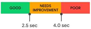
Good performance is defined as a load and render time of less than 2.5 seconds.
First Input Delay (FID)
FID represents the time from when a user first tries to interact with a page to the time when the browser is actually able to respond to that input. i.e. if a user clicks a link or taps a button, how long before that link or button will actually work.

Good performance is defined as 100ms or less.
Cumulative Layout Shift (CLS)
CLS reflects the visual stability of the website page. It is intended to discourage the types of website experience where a user starts to read or interact with a web page but the content moves without warning because some new element has been introduced to the page. In the worst case poor visual stability could result in a user going to tap a link or a button but, before the action is completed, the page shifts and the user ends up clicking on a completely different link or button.
CLS measures the total effect of all individual layout shifts for every unexpected layout shift that occurs during the entire lifespan of the page.

As can be seen from the graphic, good performance is defined as a CLS score of <0.1.
CLS is perhaps the most confusing of the core metrics to understand so it’s useful to consider in overview how this is calculated – skip to next section if you want to avoid the science!
What is a layout shift?
A web page is defined by the elements on the page and the position of those elements. An element could be an image, a block of text, a button, etc. CLS is the sum total of measured individual layout shifts of each element.
All web page elements are positioned on the page with respect to the size of the device screen (viewport). So, if we have an element that is located right in the top corner of the screen, it’s position would be a co-ordinate of (0, 0) – 0 pixels in from the left, 0 pixels down from the top.
A layout shift is detected when an element is found to have changed it’s start position. So, looking at our element at position (0,0), if this element’s position unexpectedly changed to (0, 300) – 0 pixels in from left and 300 pixels down from the top, this would be a layout shift.
There is a calculation defined for measuring layout shift of individual elements which is:
Layout shift score = impact fraction x distance fraction
To consider impact fraction, lets assume our element that is first drawn at position (0, 0) takes up the full width and 50% of the viewport height and that the viewport height is 1200px. When that element jumps down to 300px from the top, it has shifted 25% of the viewport height. The impact fraction represents the total amount of the viewport that the element consume before and after the shift. i.e. in its first position, it takes up 50% of the viewport. Then it is shifted down by 25%. So the impact fraction in this case (because it is full width) is 50% + 25% or 75% or 0.75
i.e. the element and its shift is impacting 75 % of the available viewport.
The distance fraction is simply the distance the element has moved. In our example, the element has moved 25%. So the distance fraction is 25% or 0.25.
This gives us a layout shift score for that one element of 0.75 x 0.25 = 0.1875.
So we can see that this one element alone is already placing our page in the “Needs Improvement” performance result.
As mentioned above, each individual element layout shift contributes to the overall CLS.
Monitoring Google Core Web Vitals
All website owners should be aware of their website(s) performance against the Google Core Web Vitals. Google has released a number of tools that allow website designers and content publishers to monitor Google Core Web Vitals and improve their page experience.
It’s important to look at average performance
An individual user using a specific device to access your website may experience slow page loads due to local conditions that are unrepresentative of the majority of users. Google recognises this and considers overall, average performance across either mobile or desktop devices (see above under Google Search Console Core Web Vitals Report).
A good rule of thumb is to consider the page experience of 75% of users across each of mobile and desktop devices.
Google Search Console Core Web Vitals Report
The Google Core Web Vitals report shows URL performance grouped by status, metric type for similar web pages. The nice thing about the report in Google Search Console is that it reports overall performance aggregated across all the various page loads accessible to the Search Console. i.e. it considers all the users, devices, network speeds, etc of all the real users that have accessed your site. This reflects the way that Google measures page performance as it applies to Search Ranking.
If your website has been linked to Google Search Console for some time, the Google Core Web Vitals report here will certainly give you the most representative view of how Google is evaluating the performance of your website.
Google Page Speed Insights
Google Page Speed Insights allows you to enter the address of a web page on your site and immediately test it. Page Speed Insights will give you results for both Mobile and Desktop experience. This is useful, but keep in mind that each time you run a test on a web page, you are likely to get a different result. This brings us back to the “it’s important to look at average performance” comment above.
Google Chrome Developer Tools
The desktop Google Chrome web browser, and other browsers based on Chromium technology such as Microsoft Edge, provide a set of developer tools built into the browser. The developer tools can be accessed from the Google Chrome menu as shown below.
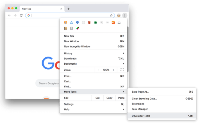
In developer tools, look for the Lighthouse tab. Lighthouse will allow you to measure “simulated” expected performance of the web page currently displaying the browser. You can select to simulate either desktop or mobile devices when running Lighthouse tests.
How do I ensure good website page experience and good Google core web vitals scores
This is a complex subject and each unique website design is likely to present its own challenges. For example, an e-commerce site with a lot of dynamic content will likely require more attention than a simple static brochure website in order to meet Google core web vitals requirements. As such, the following is certainly not exhaustive or detailed but rather provides a “getting started” overview of the things you should/could be looking at.
Don’t panic
It is true that some websites will start to be affected, to a greater or lesser extent, by the inclusion of Google core web vitals into its search engine ranking algorithms from May 2021. However, this the start of a process. A majority of websites won’t currently fully meet the performance criteria defined by the core web vitals metrics. The introduction of performance metrics into search engine ranking should be seen as an encouragement to start to improve the performance and user experience of your website. As such, now is a good time to review the overall performance and experience of your website and approach improvements in a methodical way.
Use the Google tools to start to asses your website performance and identify any issues
Running any of the google tools mentioned above will not only give you the current Google core web vitals “score” for your website, but will also provide details on what elements and resources used by your website are causing problems. It’s entirely likely that there are some obvious “low hanging fruit” identified here that can easily be addressed to immediately improve your performance score.
As you make changes to your website to try to improve performance, always evaluate the changes made using either Page Speed Insights and/or Google Chrome Developer tools to confirm that you’re making progress.
Consider content that appears within the viewport (“above the fold”)
It’s important to keep in mind that Google Core Web Vitals are all about initial page load and the content displayed at the top of the page that is entirely contained within the viewport of the device being used. i.e. what the user sees on their device before they start to scroll down the page.
Consider the design of your website. Remove any unnecessary elements – particularly elements that automatically pop-up (interstitials)
This is a good opportunity to review your website and streamline its design to remove any elements that get in the way of the overall page experience for the user. In particular, look to remove any un-needed automatic pop-ups that appear unexpectedly and obscure main page content. These types of obscuring pop-ups are known as interstitials. It is far better to incorporate ads, call to actions, sign-up forms within the main body of your website page rather than have them appear and block content.
If you’re considering a new web design, ensure your web designer understands the engineering challenges presented by Google Core Web Vitals and has a process in place to ensure website performance as well as great looking web pages. Many web designers do not have a technical background and may use design tools that produce inherently poor performing websites. If your web designer falls into this category, consider augmenting their talents with a resource able to optimise the performance of your website.
Optimise, as well as design, for mobile
When you start to assess your website’s performance against Google core web vitals using either Page Speed Insights or Chrome Lighthouse, in all probability you will see far worse performance for mobile devices than for desktop. This is because Google’s simulation of mobile devices assumes much lower network connection speeds than for desktop devices and much reduced computing power and resources on the mobile devices.
Think about optimising page layouts and content for mobile experience. In particular, think about images. With a responsive website design, your images probably already scale to display correctly on different screen sizes but do you really need a user to download a 1920 x 1080px image over a mobile network to have it shrunk to a display size of 800 x 450px? It’s better to ensure that an image that is sized to 800 x 450px is downloaded.
Keep website platforms, themes and plugins up to date
Modern website platforms are just like your desktop computer or smart phone. They need frequent updates to ensure continued performance and security. Many website platforms, like WordPress, provide access to a wide range of “themes”, “plugins” and “add-ons” that you can use to change the look and add features and functionality to your website. These plugins and add-ons are just like apps on your phone or computer and also need constant updating.
It may be the case that platforms, themes and plugins currently have inherent issues that prevent websites using them from getting a good Google Core Web Vitals score. As such, many of these platforms and plugins are likely to be the subject of a number of updates in coming months as developers try to improve the performance of their products to allow customers to meet Google Core Web Vitals performance requirements.
If you’re using WordPress review all the plugins you are using. Deactivate and uninstall any that you don’t need.
Each plugin you add to your website may inadvertently slow it down as the plugin adds more resources to be downloaded and more server overhead. Now is a good time to review the plugins that you are using and cull any that you no longer need. If you’re finding a particular plugin is causing you problems but you really need its functionality, consider reviewing the market for alternatives and test those to see if performance is improved.
Consider your web hosting
Your website is essentially just a computer program running on a computer server (web host). The speed and resources made available to your website by your web host determine how quickly your website runs and how fast it can respond to user’s requests for web pages.
The demands placed on your web host depend on the complexity and dynamic nature of your website. For example, an e-commerce website will require more computing power and resources than a simple static brochure website.
Many websites, particularly small business websites use “shared web hosting”. Essentially, your website is sharing computer resources with potentially hundreds of other websites. There is nothing inherently wrong with “shared web hosting” but not all shared web hosting is created equal. If you’re using shared web hosting make sure that the resources available to your website are suitable for the type of website you’re running. Make sure also that your web hosting provider is focussed on performance and that their shared web hosting is configured to ensure consistent performance across all websites on their platform.
If you’re running a more demanding website like a good sized e-commerce website or membership site, now might be the time to consider moving to a different type of web hosting, such as a virtual private server or even dedicated server that will provide more dedicated resources to your website. The cost to do this compared to shared web hosting will undoubtedly be much higher but it may be cost effective as compared to losing business due to lower search engine ranking.
Is your website using effective web optimisation tools?
A modern website uses a lot of different resources in its design. Most obvious are the images, videos and audio that we may embed on the website. However, there are also a lot of resources, hidden to the average user, that are key to the proper rendering and display of a given website page. These resources will include HTML, the code for what is on your website page; CSS, the code that determines how your website page is displayed and javascript, the code that controls the dynamic and interactive elements of your page.
Each of these resources must be requested and downloaded to the user’s device to enable your website page to be displayed correctly. The more resources your web page uses, the more requests there are from your user’s web browser to the web host and the more there is to download. The more plugins and features you add to your website, the more resources are required.
Fortunately, there are tools available that can progressively review the resources used by your website and automatically package and deliver them in an optimised way. The aim being to both reduce the number of network requests for resources and the actual size – and hence time to download – of those resources.
On web platforms like WordPress you will find 3rd party Web Optimisation plugins available that you can install. Some Web hosting packages, such as our Professional WordPress Web Hosting include built in web optimisation tools.
Is your website using effective caching and/or CDN?
Regardless of how well your website is designed and/or how fast your web host, a typical modern website will still have inherent inefficiencies. When a user requests a web page from your website, your web host must generate that page and all resources required to properly render and display that web page in the user’s web browser. Some of those resources, however, don’t change that often and don’t really need to be generated from scratch for every user request.
Enter caching. This is the process of storing copies of resources that don’t change often in a cache or temporary storage location so that they can be accessed more quickly. Typically, the cache is a physically different computer to your web host. This has the added advantage of reducing the number of resource requests to your web host as cached resources are requested from the other location.
There are generally two types of cache used by websites.
Web browser caching
The user’s web browser will provide it’s own local cache of files and resources. This dramatically speeds up the operation of websites that the user visits often. Resources are loaded directly from the user’s own device rather than from your web host. If the website is configured correctly, it can reliably instruct the browser what files and resources should be cached by the web browser and how long those resources should be cached. It’s important, therefore, to ensure your website is configured with an effective web browser caching policy.
CDN caching
A CDN, or Content Delivery Network, caches resources such as images, videos, web page code, etc. on servers external to your web host that are physically located closer to end users than the web host computer itself. For example, the CDN used by our Professional WordPress web hosting provides “local” servers around the world. This provides two advantages. The first is that CDN servers are highly optimised to deliver cached content as quickly as possible, much more quickly than the web host. The second is that resources are downloaded from cache servers “local” to the user, meaning it can be delivered faster.
A good way to think about the concept of caching is to consider a typical supermarket setup. In this context, your web host would be the supermarket distribution centre where all of new goods originate from. The CDN cache would be your local supermarket where you can quickly go to buy goods. The browser cache would be your own kitchen cupboards where you hold a small stock of the products you use most often.
Conclusion
So moving forward, in order to maintain search engine performance, we need to take a holistic view of the overall “page experience” for users visiting our websites, which can be broken down into:
- Ensure website is optimised for mobile browsing – Mobile Friendly
- Ensure website pages do not contain any misleading content or malicious software. Ensure page content is relevant, reads well and provides useful information to the intended user. – Safe Browsing
- Ensure your website is secured with a SSL certificate and is served using HTTPS
- Ensure that your page doesn’t show any advertisement or other superfluous elements that block main content while it is downloading – No Interstitials
- Ensure that your web pages load quickly and focuses on user interaction and visual stability – Core Web Vitals
If the above seems a bit overwhelming, a lot can be achieved by adopting a methodical process to evaluate and improve your website performance. There is also a lot of resource available that can help including aento’s own website design team. We’re always happy to have a no obligation, conversation with you about any aspect of web site design, so please feel free to contact us at any time.